If you’ve been following my social media accounts, you’ll know that I was working on a quilt for the Houston International Quilt Festival and Competition that is taking place this coming fall. I have entered the show a few times before (and getting a quilt in to the show is a huge deal in its own right.)
I didn’t want to post any photos showing too much until after the deadline for the competition was closed. Color me paranoid but my designs have been knocked off before and didn’t want that to happen again, lol. On top of that, I didn’t even finish the quilt until 24 hours before the submission deadline anyhow. International Quilt Association (the peeps who are large and in charge of the show) posted this image on their Facebook page the day before the deadline and the hubby and I just started busting up because it sums up my creative process so perfectly:
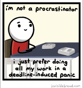
Hilarious right?? But come on, with this baby on the way, everything has been a little bit of a deadline-induced panic!
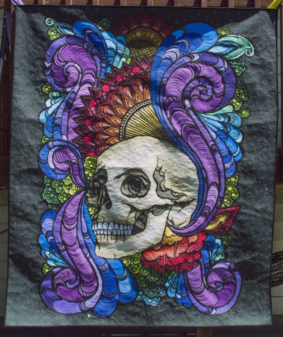
Anyway, I thought it would be kind of cool to show you in this blog post the process for my quilt which I fittingly named “Disparity”. So let’s get to it…
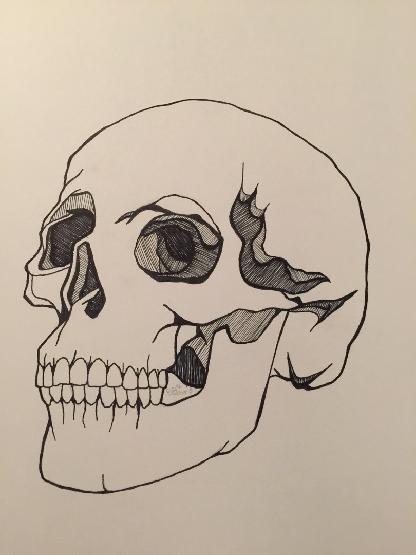
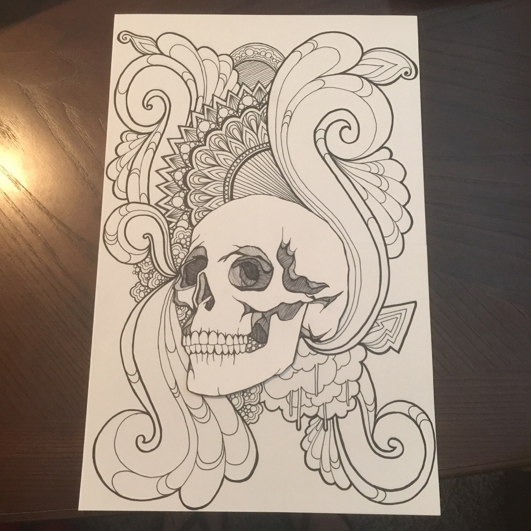
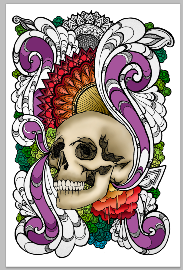
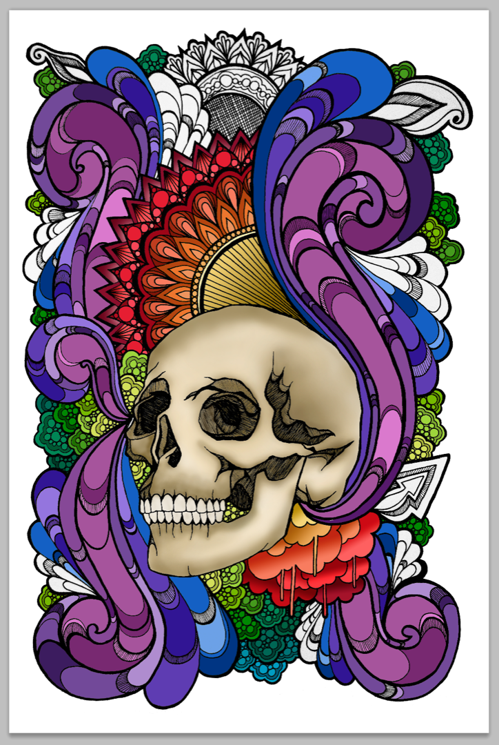
For those of you who don’t want to read the process and just want to see the finished quilt, here you go!
And now for the process of how this quilt came about…
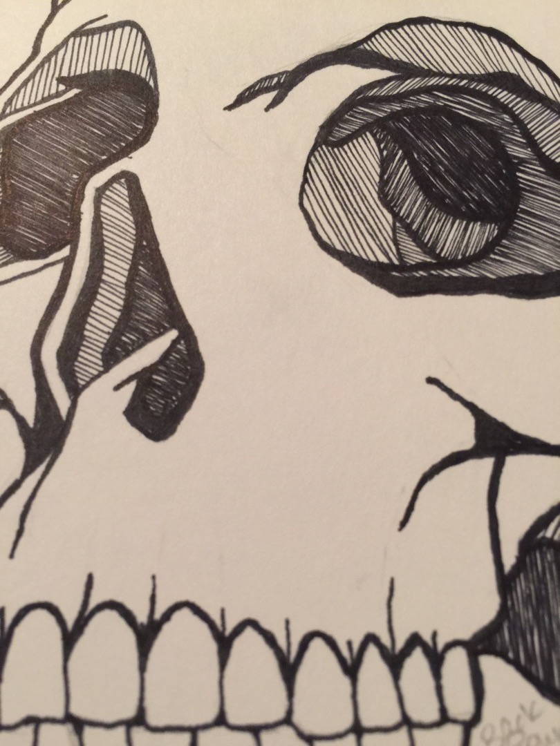
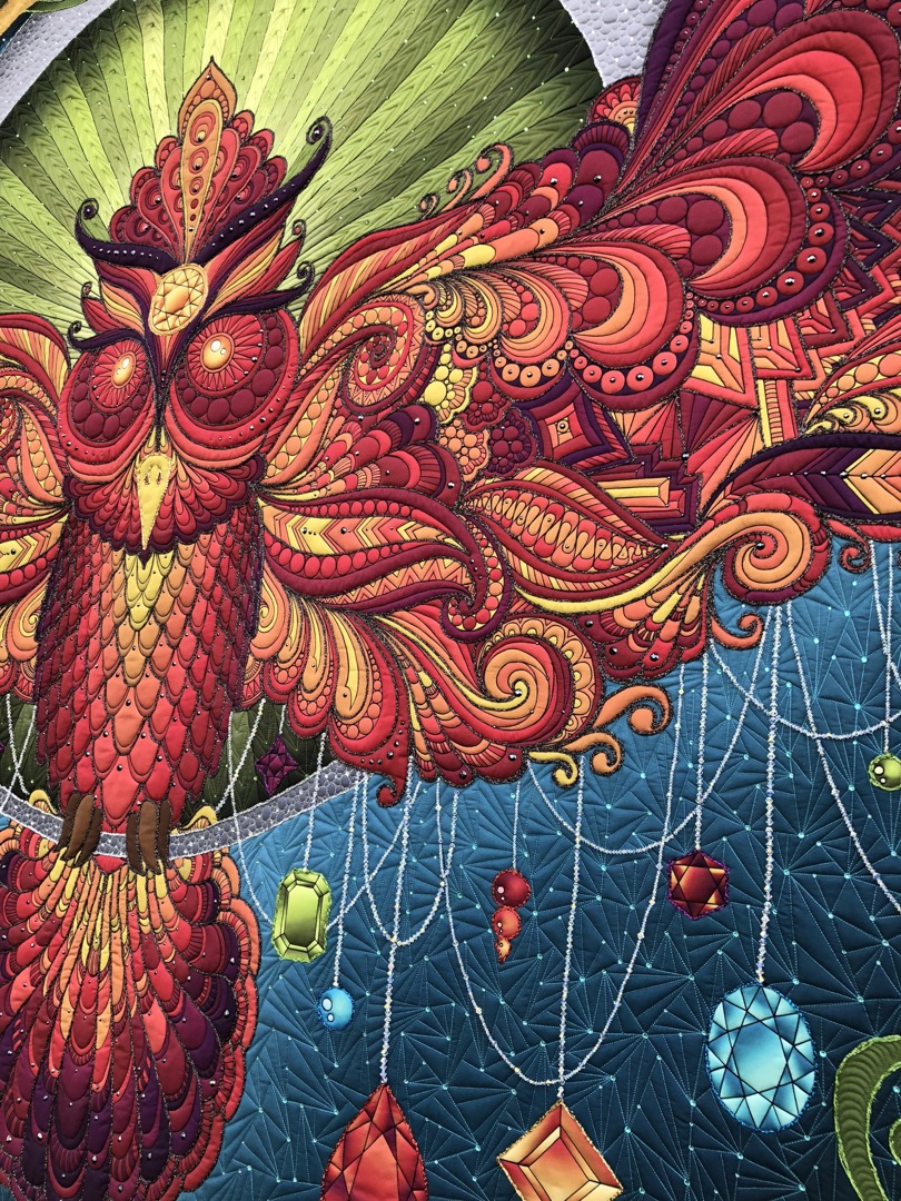
I have actually been working on this design concept for more than 2 years now. We had the death of a close loved one in the family in 2014, and as heart breaking and hard as that trial was, I found that there were so many tender mercies throughout that experience. It had me pondering about what it means to find joy and peace even in the midst of extremely tough trials. I kept thinking about how different people handle death in different ways, and this quilt ended up kind of visualizing how I had worked through the death of this person who meant so much to me, and who I looked up to so much. I found that working through this pain in a creative way helped me to remember what life and death means to me, and how much beauty I was able to witness through the trials that I had seen. I wanted to make a visual representation of how profound it was for me to feel that peace and love from God even when I was sad. Hence, I chose to make the center piece of the design a skull. A skull typically represents pain, suffering, woe, and sadness. Along with the skull I wanted to show a stark contrast, so I used the entire rainbow, and very aesthetically pleasing flourishes and soft, inviting, organic shapes and curves. I wanted to create opposition, and make people see a skull in a new way, as something to be celebrated and adorned. After all, if a skull exists, it means a person existed- a person with thoughts, feelings, emotions, and experiences.
Here are the steps that I took to actually bring the quilt to fruition…
I first did a simple experimental study project of a skull. I lightly sketched out the skull, added color with my watercolors, and then went over the design using fine point black markers.
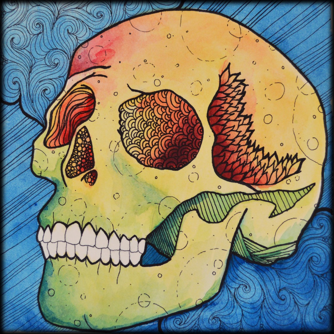
This was a lot of fun! But to be clear, this was just a warm up for the actual design that I ended up creating. It was fun to just do something that was low stakes to expand my creativity and not be afraid to just really try anything without worrying if I was going to mess something up. I felt like this skull design was a good start to the happiness that I wanted to evoke while using a skull, what with all the bright colors that I used when I watercolored it. But it just still didn’t quite convey my idea as strong as I wanted. I do still like this design and it is now available in my shop as custom printed fabric, in 3 different sizes.
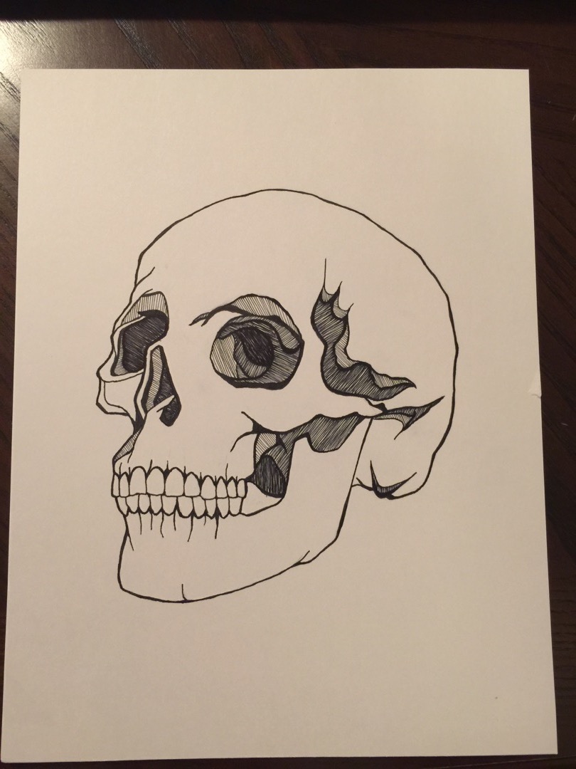
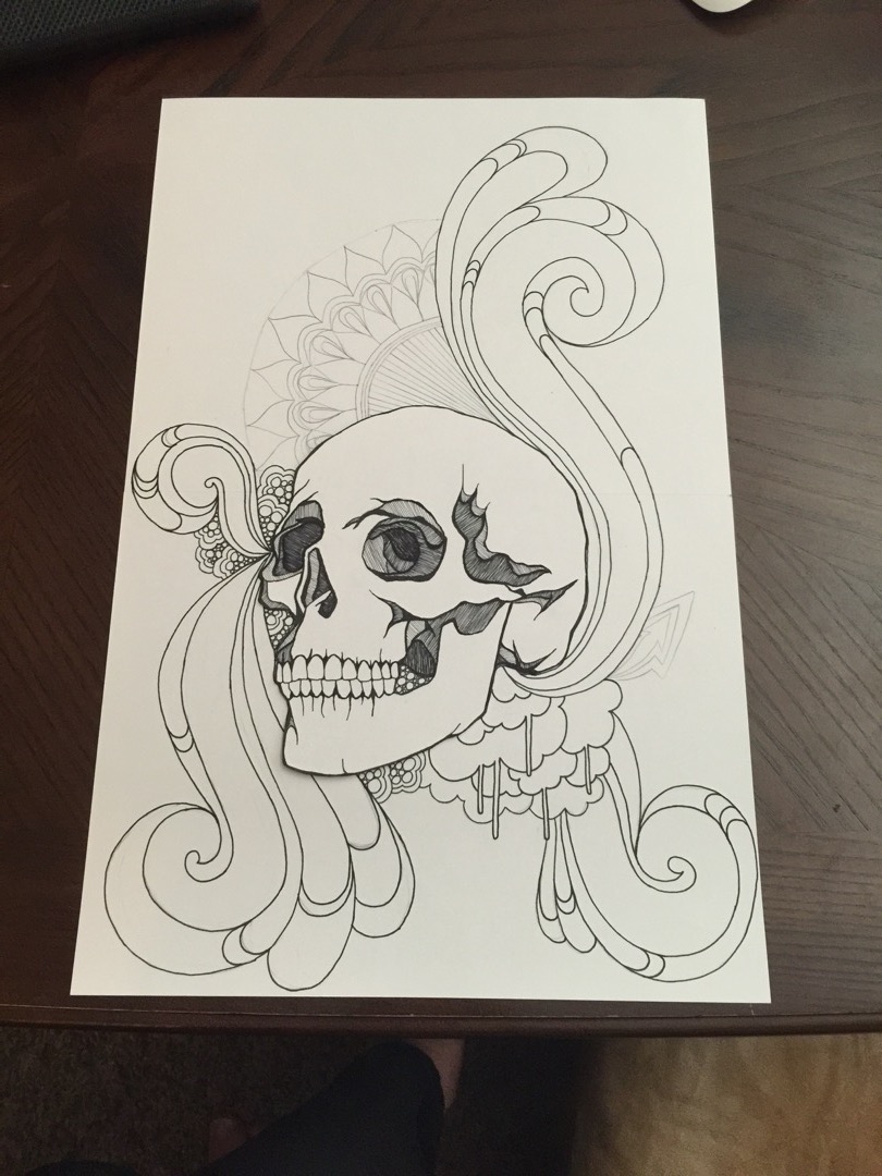
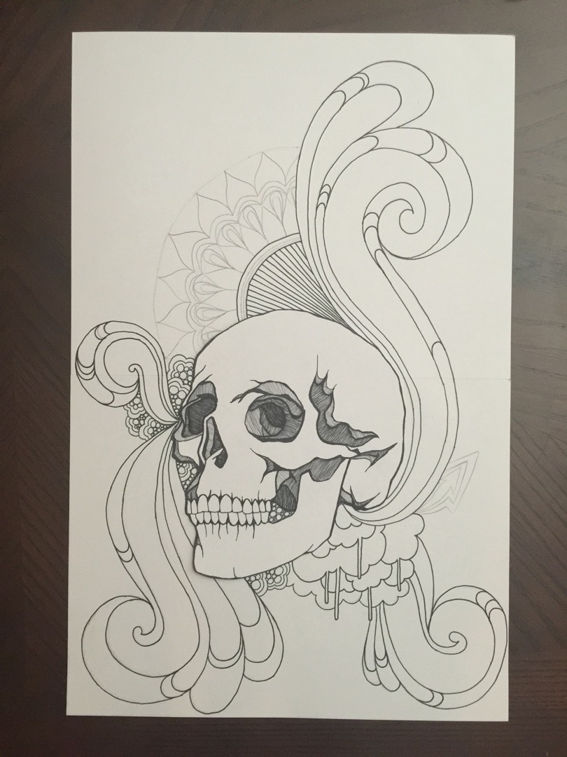
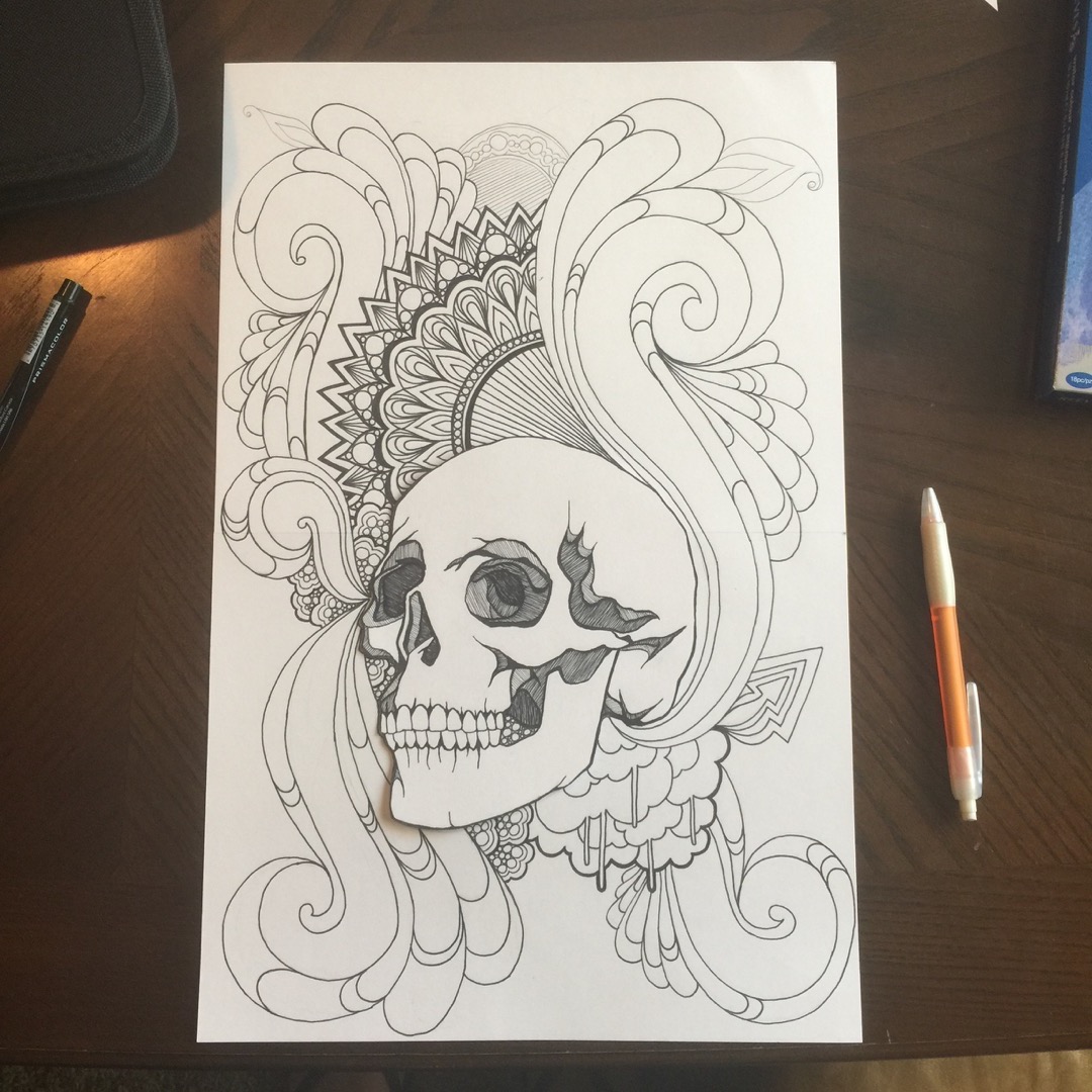
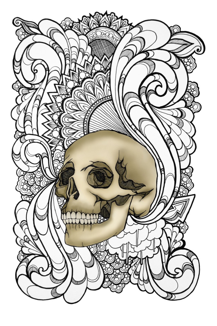
From there, I felt like I had a better idea of the direction I wanted to take. So, I felt like it was time to start the real design. I started by sketching the skull, and then when I was happy with the general lines, I went over them with a black fine point marker, and then also added some shading lines.
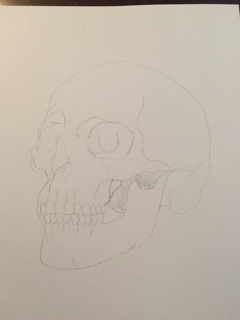
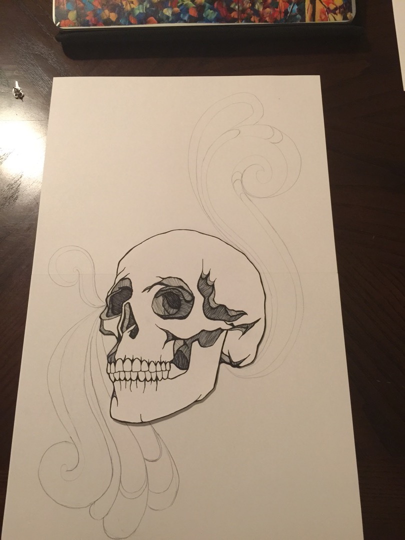
Once I was done with that, I realized that the paper I did it on was too small, and I didn’t leave enough space around the skull design to be able to add the flourishes at the scale that I wanted.
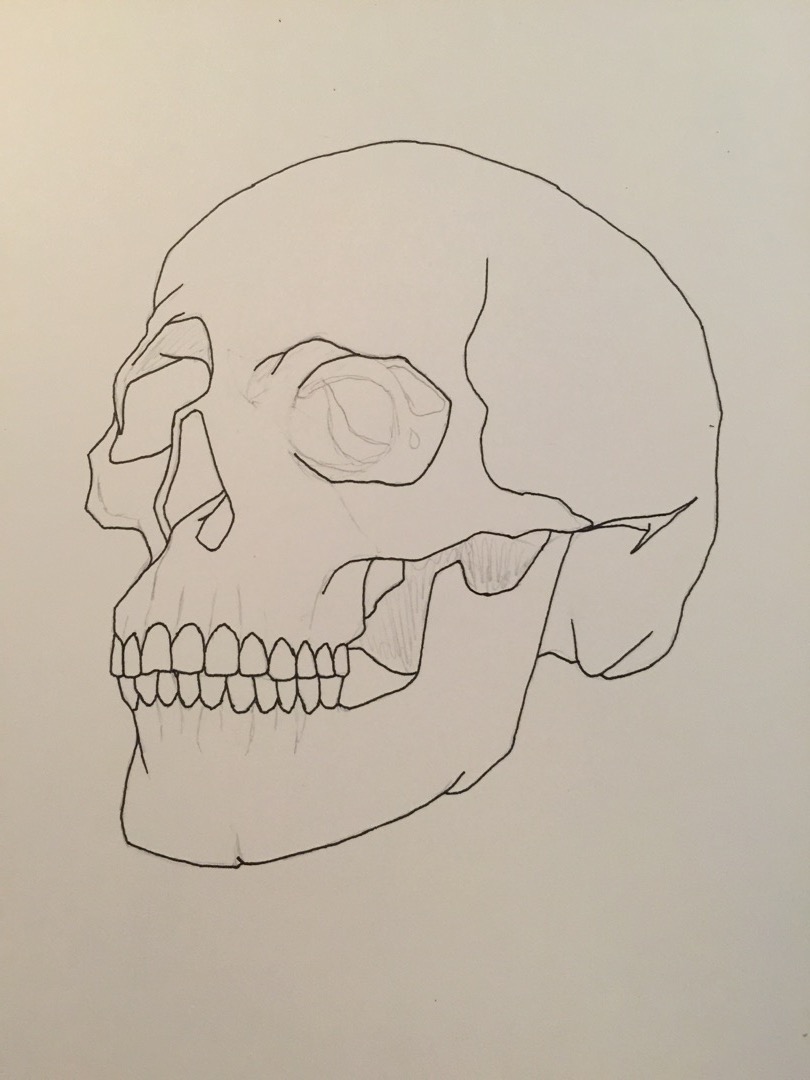
So, I cut out the skull, and then I taped two new 8.5 x 11 card stock papers together, and then taped the skull to that paper. Then, I started sketching out my flourish designs (first in pencil, and then if I was happy with them, I’d go over them with my fine point pen.
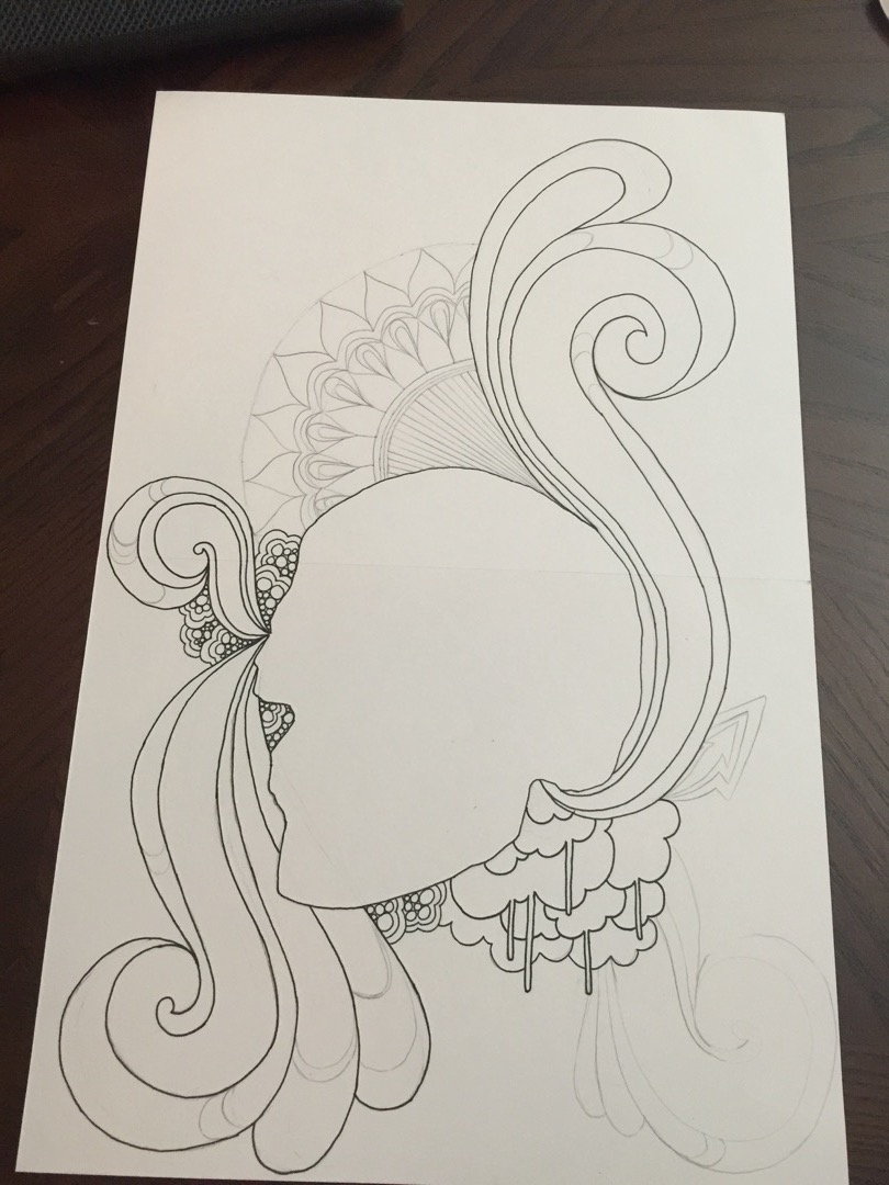
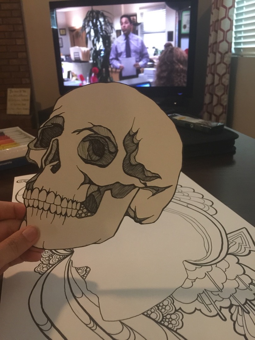
(yes, that is The Office playing in the background.)
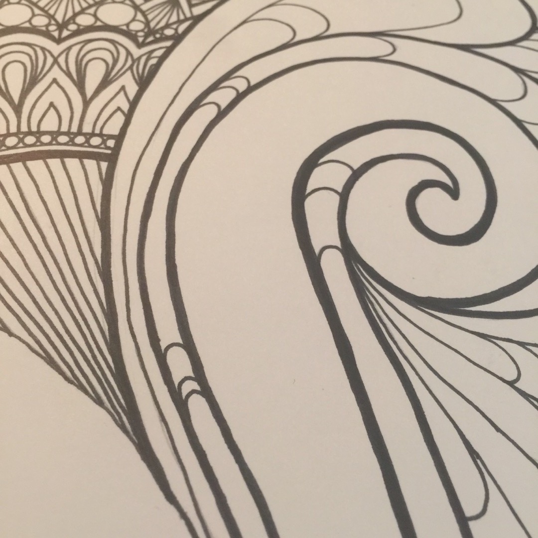
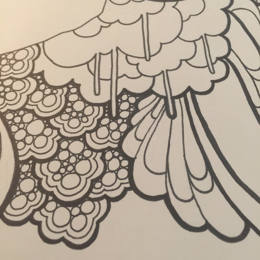
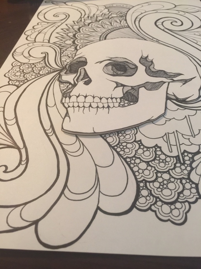
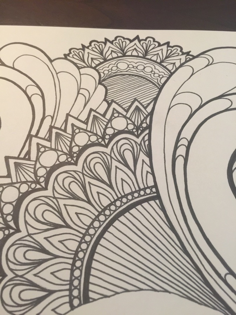
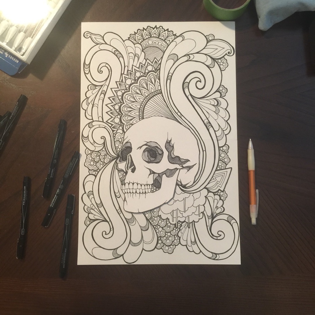
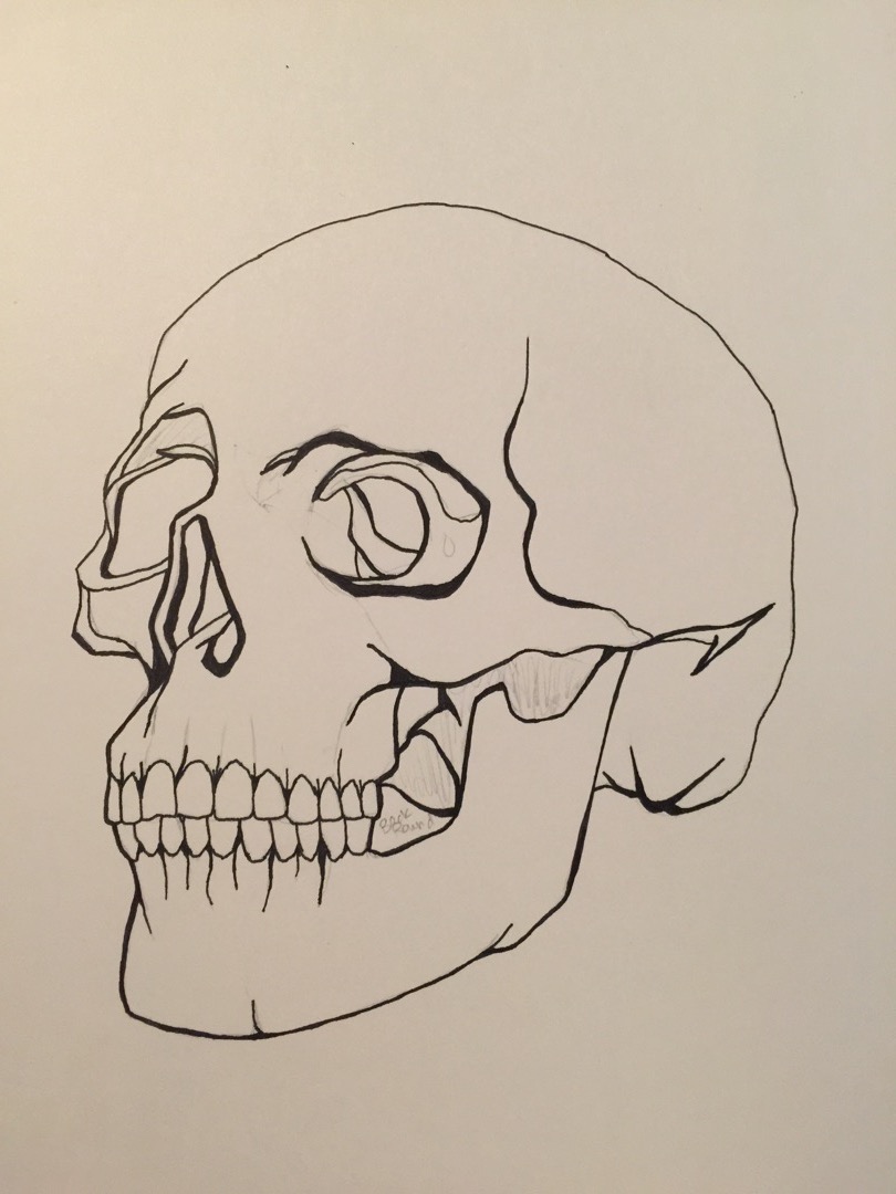
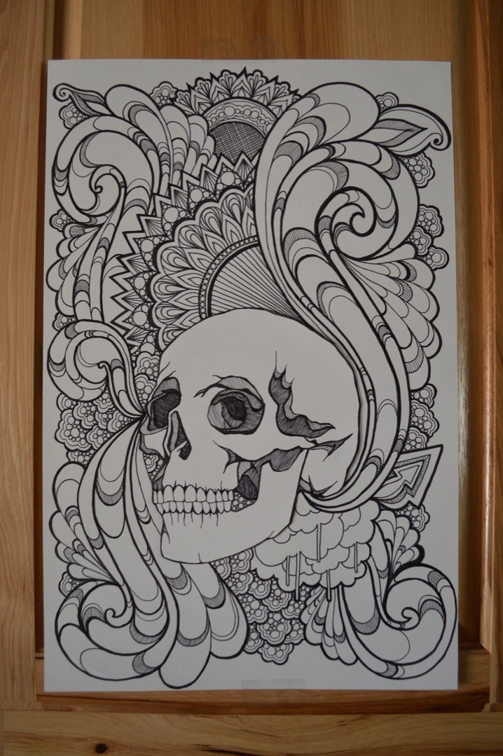
There you go! That is how I created all the line work for the full design. From this point, I took things digital. I was pretty scared to add color to the actual paper design for a couple reasons: I didn’t want to because I didn’t know how the color would handle the seam where I taped the two papers together, and I also am somewhat noncommittal and the thought of adding color (knowing that I can’t erase color) gave me anxiety. So, to photoshop I went!
I took a really nice, Hi-Res photo of the design, and then imported it into photoshop. This was also helpful because then I could clean it up and make the lines more crisp, as well as eliminate any pencil smudges that might have been left behind.
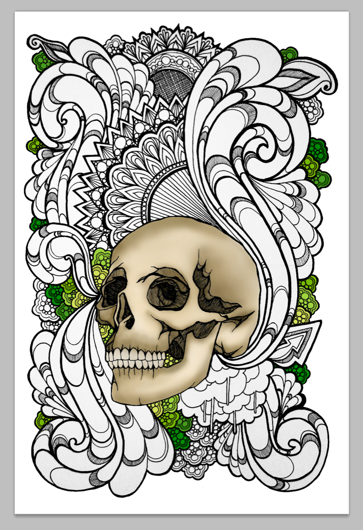
Once it was imported into photoshop, I was able to create a rough coloring guide to get a better idea of the color profile I would use. This was really helpful in just getting my brain organized so that I wasn’t just coloring every little motif some random color and then hating it when I was done.
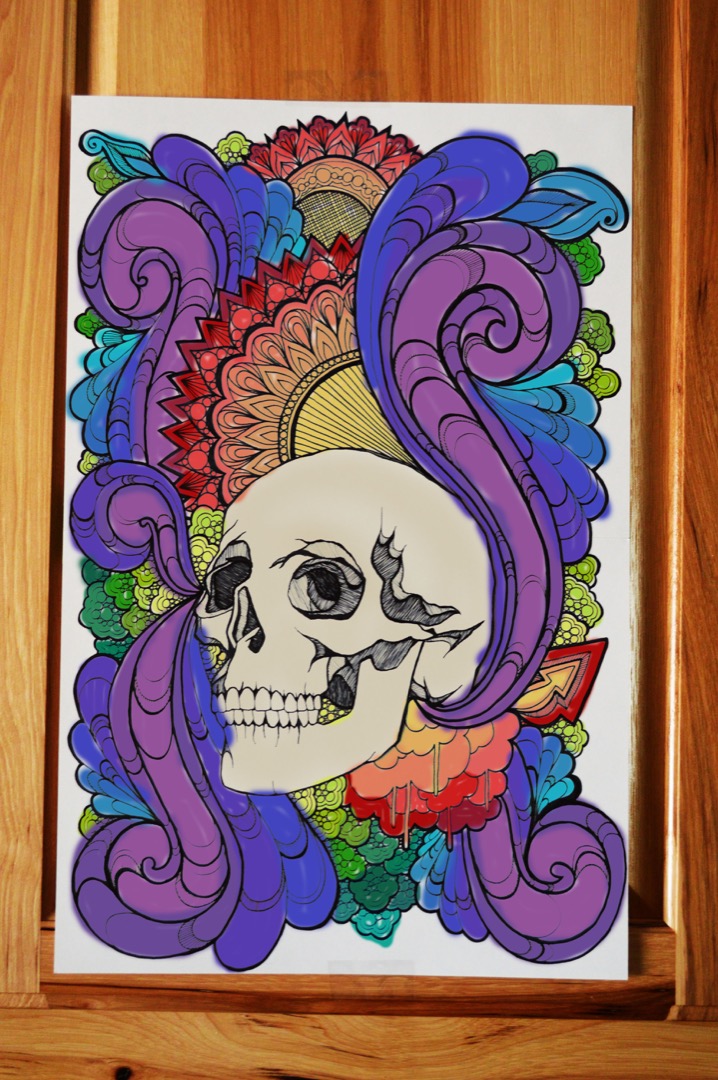
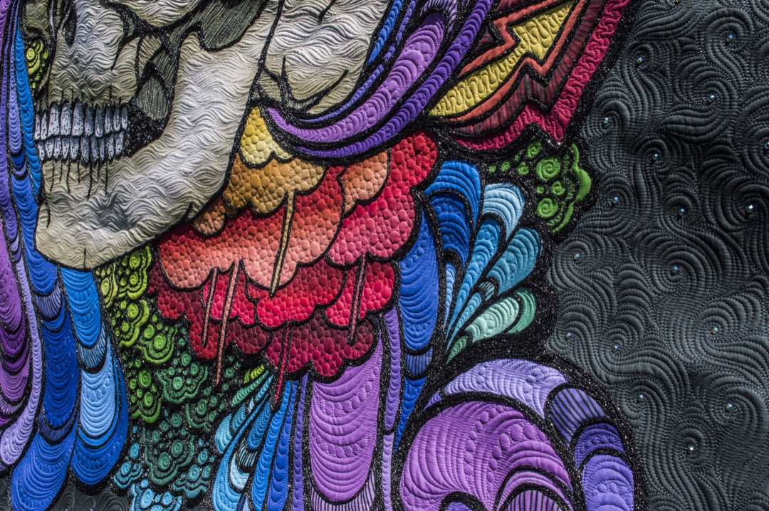
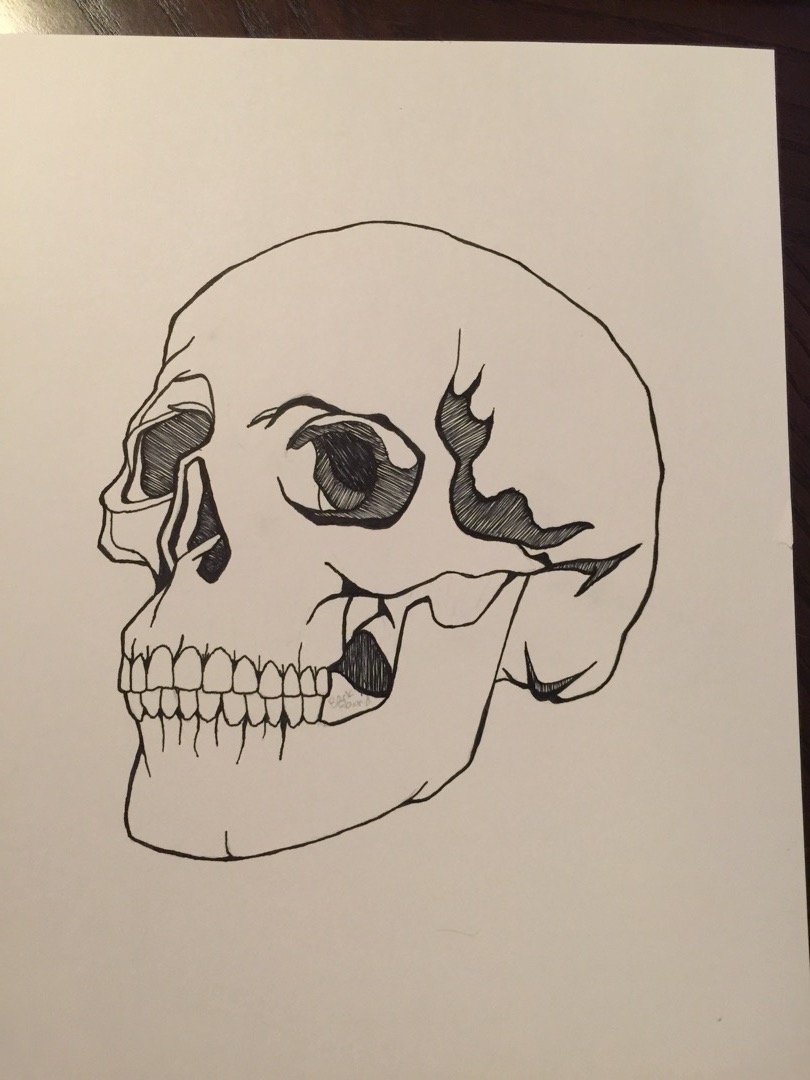
So, once I had the color guide finished, I was able to hit the ground running with coloring in the spaces. The first thing I did was colored and shaded the skull. I am really happy with the shading, I think it turned out really cool (especially once I quilted it, it just came together perfectly.)
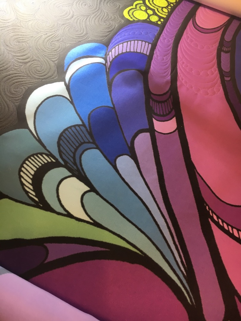
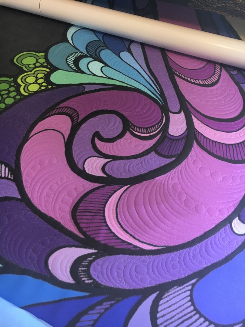
Then I colored in all the motifs…
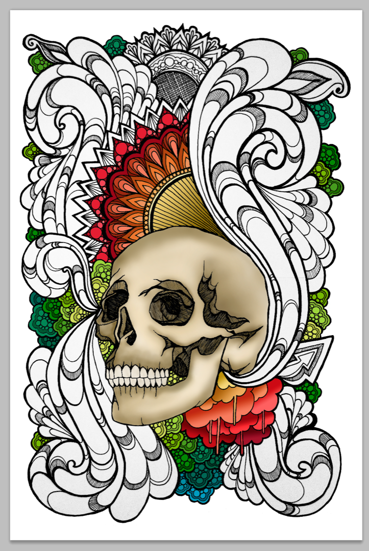
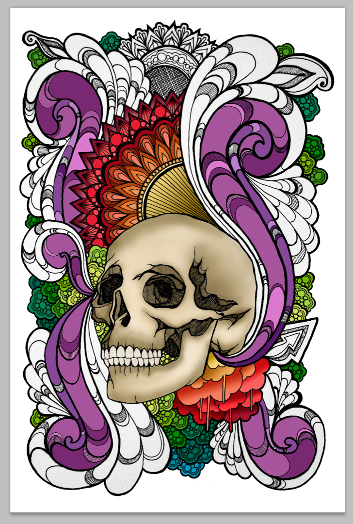
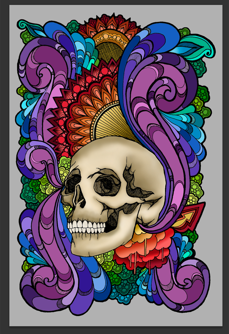
And then the digital design was complete! I did end up making the background a darker grey once I had the fabric printed. So, I sent the file out for printing (which I get a lot of questions about. Custom printing fabric is soooo fun, and definitely my favorite way to create quilt tops, but very expensive. But, can you imagine trying to piece or appliqué a design like this?? Yeah, right. That ain’t happening! Haha)
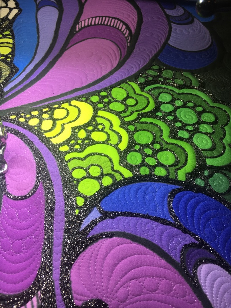
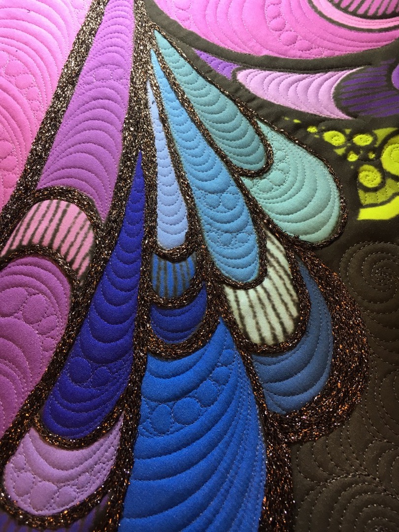
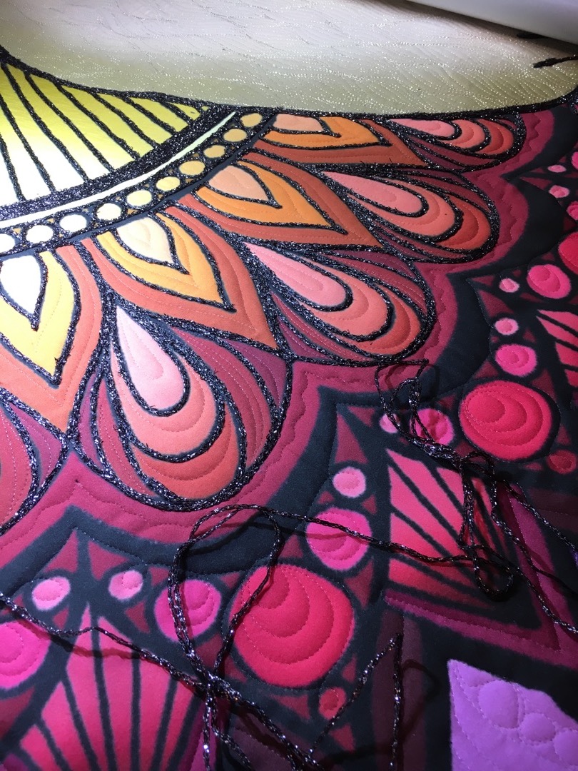
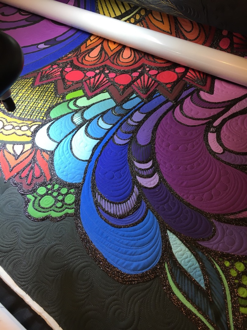
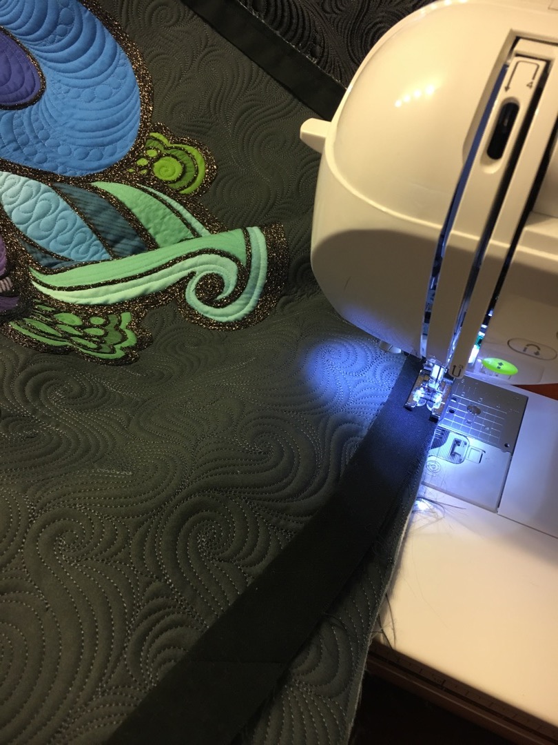
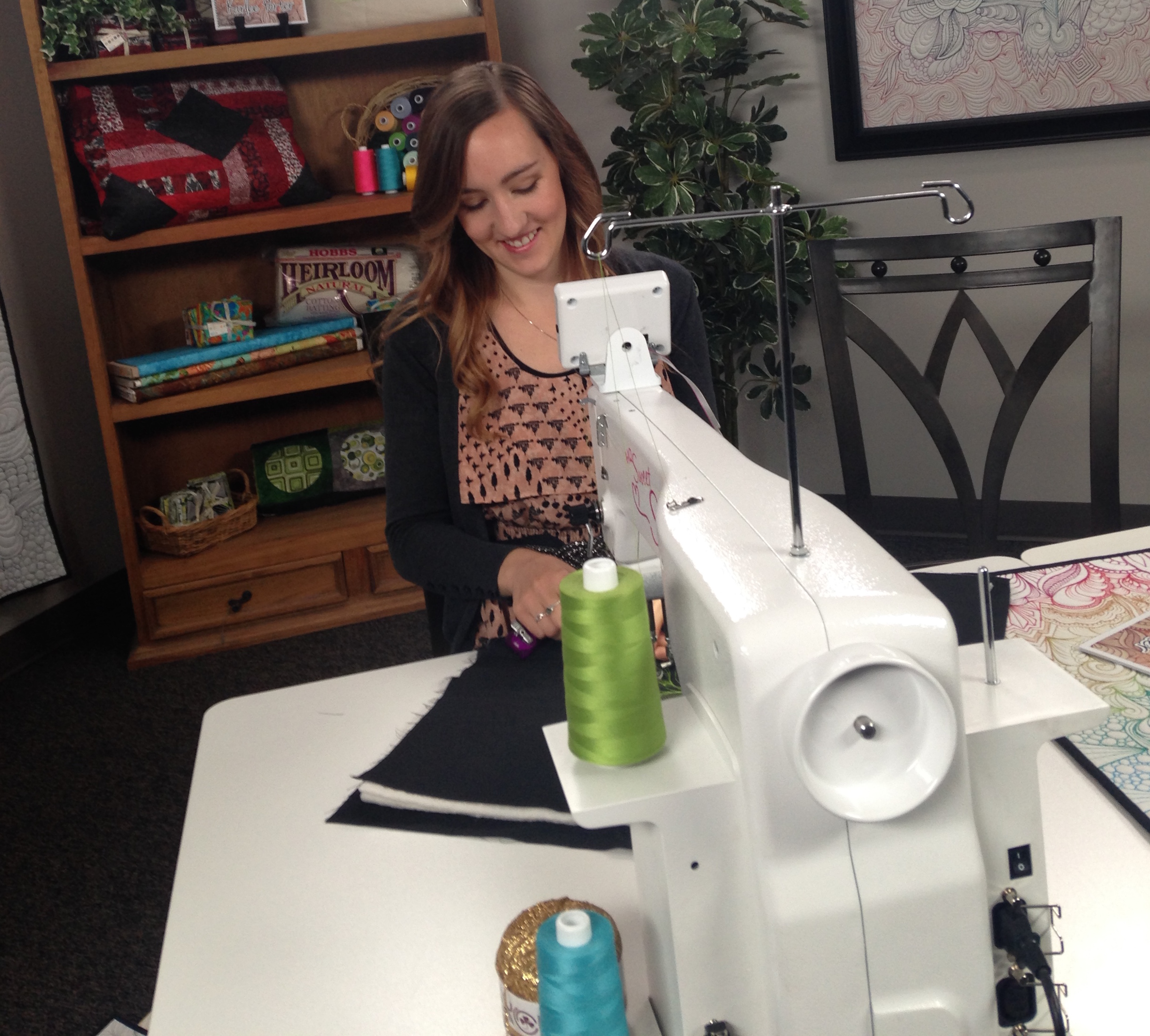
Once the fabric arrived, it was time to get some batting and backing fabric, and load it on to my quilting frame! I used a really pretty 40 wt deep grey thread for the background of the quilt, and then I used monofilament to quilt all the various colorful areas. I did think about trying to match my thread to all the different colors in the fabric, but then I remembered that that would be insane. So, MONOFILAMENT TO THE RESCUE! (which, if you know my you know by now that I used monofilament quite a bit and I really don’t care who knows it.)
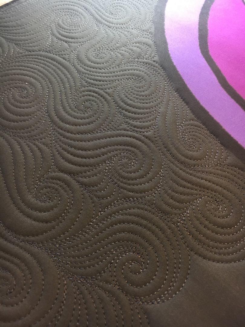
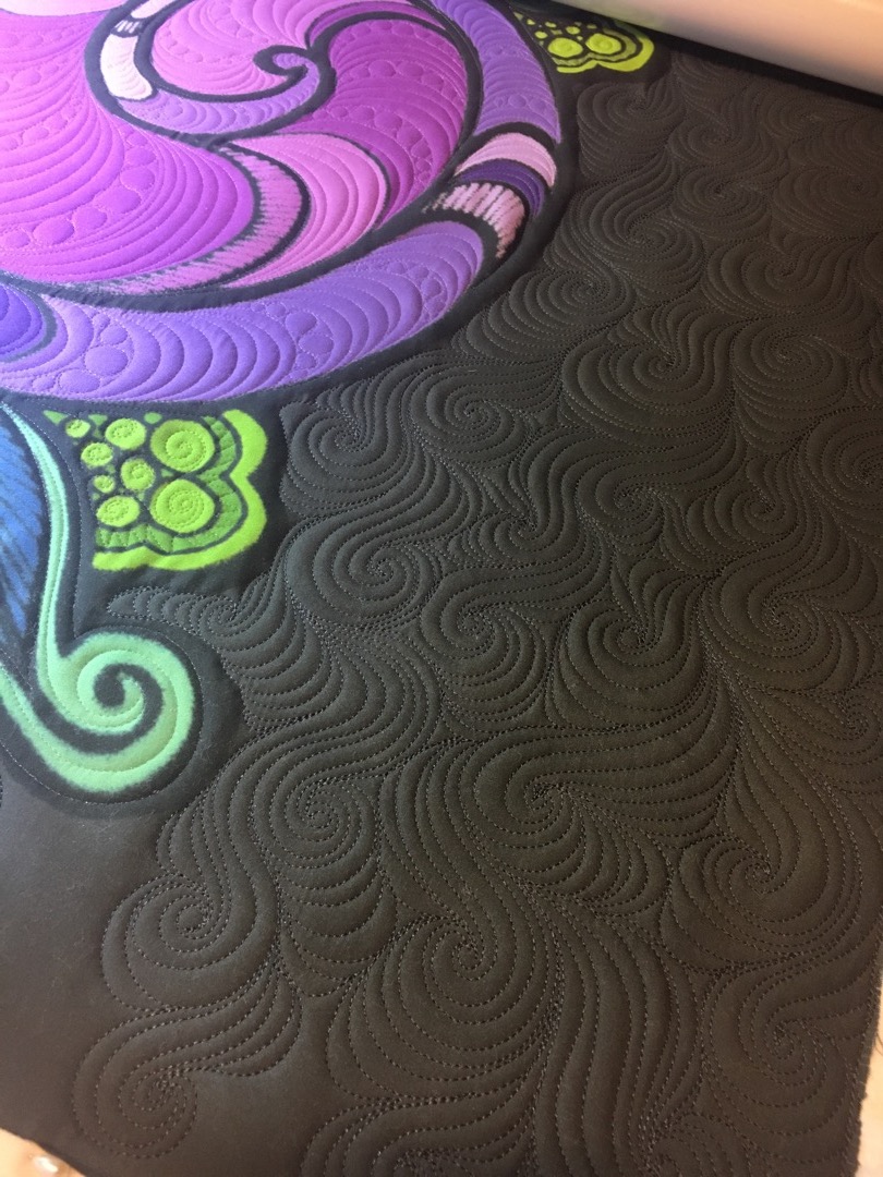
I did my signature “Karlee Curls” in the background because, duh, can you say CROWD PLEASER! Haha. But really, I love this design and I can’t remember the last time I did a show quilt that didn’t incorporate this design. I think it will always be my favorite design to quilt.
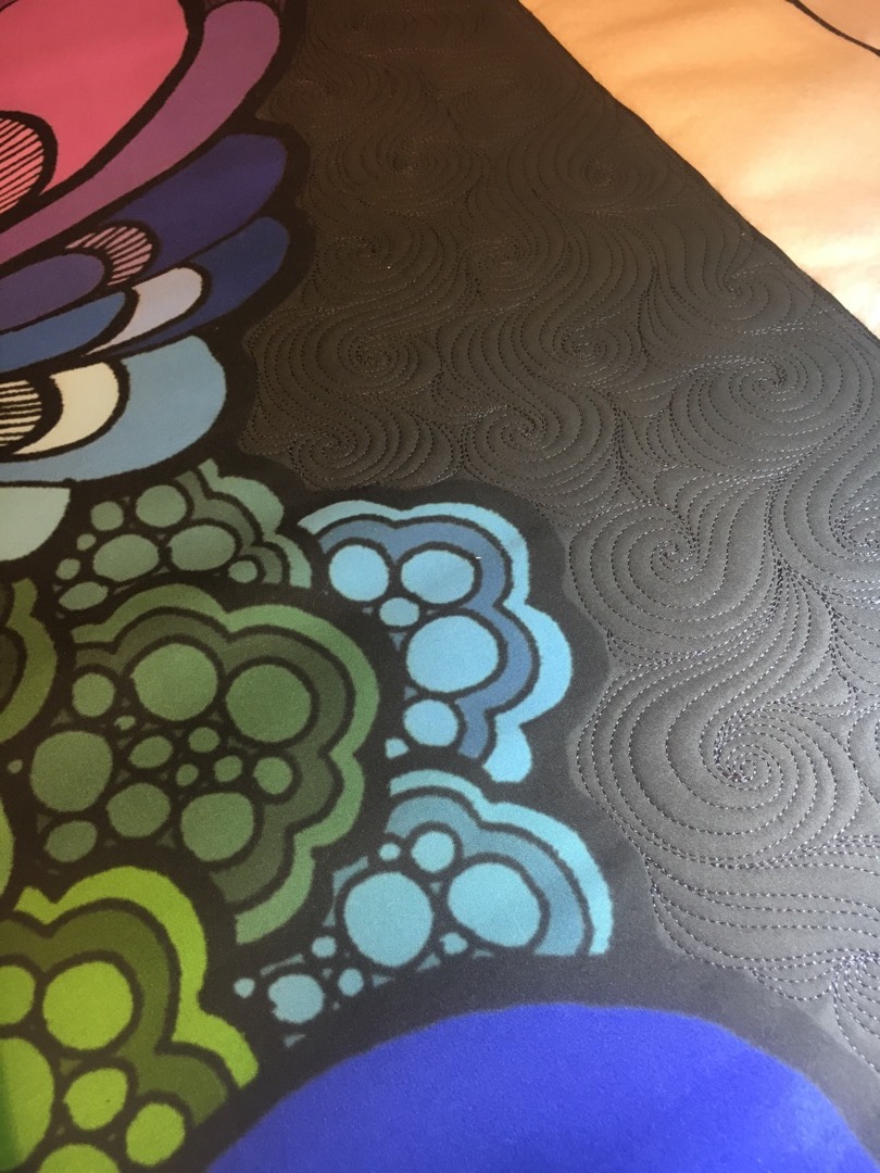
And of course, pebbles. I love doing pebbles and they fit into this area of the quilt so nicely. (and I know my photos look like they are upside down, but they aren’t. The quilt top is upside down, because that is how I had to load it on to my frame so that the curls would flow in an upward direction. So I wanted to show you me process as I saw it while I was quilting.)
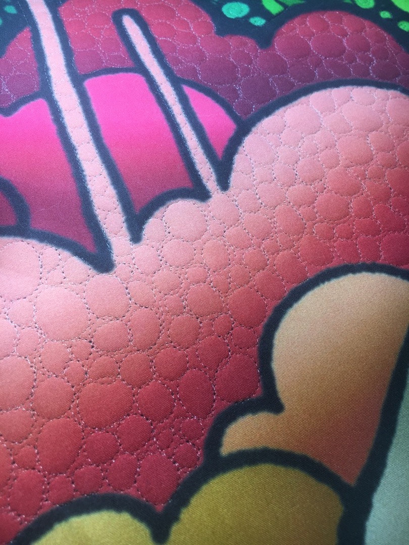
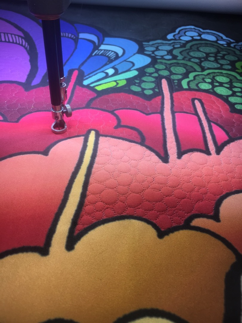
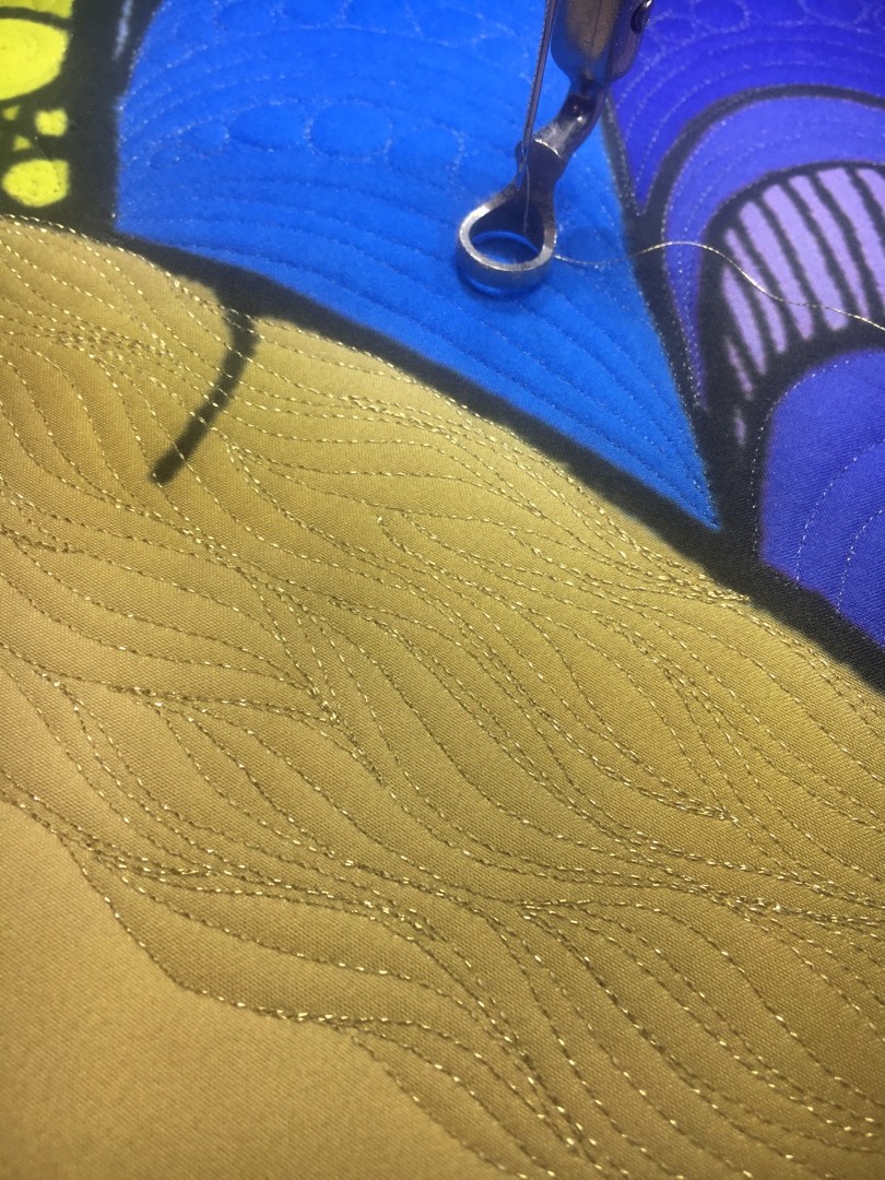
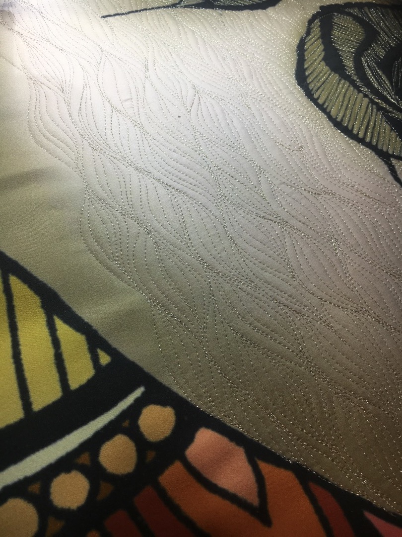
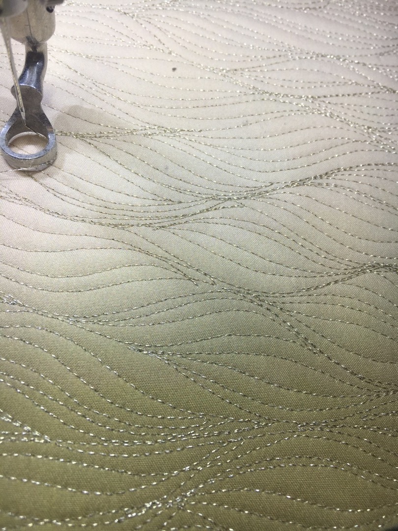
In the skull, I decided to use this really pretty, gold metallic thread, and I did a wavy type of design. I think it fit perfectly, and added just the right amount of shine to the quilt.
I really loved that the fabric was printed, and I like using the monofilament, because I can easily move from one area to the next and add texture, without worrying about my thread color distracting from the printed colors.
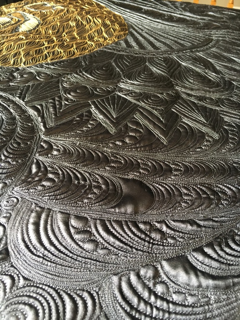
Once I had quilted through the entire quilt top, it was time to go back in and fill in all the black lines of the design. You can see that some of the black lines are quite thick, especially around the outer edge of the design, so I really wanted to fill them in somehow to really polish of the design and make it look nice and finished. So, I took charcoal metallic yarn and filled it all in with a technique called couching.
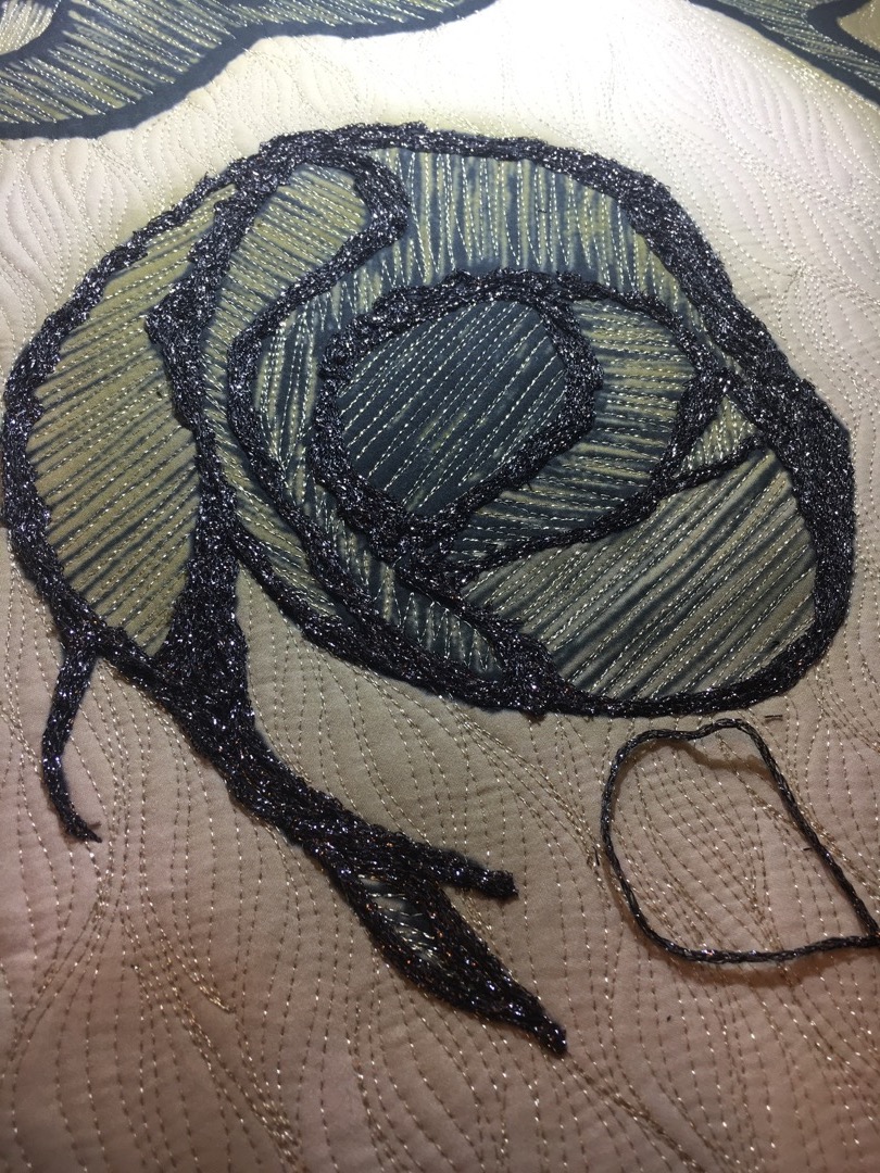
This worked sooooo well to fill in all those black areas that would have otherwise been really hard to put a motif in, and ugly if I left it un-quilted.
Once all the quilting and couching was done, I bound it with a solid, black fabric. (Kona cotton is always my go-to solid cotton fabric choice.)
Here is a view of the back of the quilt. I used charcoal bobbin thread, except in the skull, where I used gold bobbin thread. I used a satin fabric for the backing, and I think it turned out super pretty. I just really hope it won’t snag too easily over time.
Lastly, I adorned every little Karlee Curl with a Swarovski Hot-Fix crystal.
And there you have it folks!
Here is the awesomest news about this quilt: The deadline for the quilt competition was May 26th, and I just found out on July 13th that this quilt was ACCEPTED into the show! They said that this year they had so many entries that they could only accept about 56% of the entries into the show! So, now I just need to make a label for the back of the quilt, as well as a hanging sleeve so that it can properly hang at the show! So I’ll send it in, and the judges will take an up-close look at the design and craftsmanship, and then the winners will be notified sometime in the middle of September!
Finally, the COOLEST part of this quilt is that because it is custom printed fabric, YOU can make this quilt too, if you want! Click here to order your own Disparity fabric and take it directly to your quilting machine!
Thank you so much for reading, and I hope you enjoyed seeing my creative process. Now we will just have to wait and see if it wins any prize in the competition. Wish me luck!
Be great to each other,
-Karlee

21 thoughts on “Disparity – Houston International Quilt Competition 2017”
So beautiful. I was working on my own design over the last few days and thought I should see if I could turn it into a quilt. My mom actually suggested I look you up because the ideas in my brain sounded a lot like what you do. Your work is GORGEOUS. I hope to learn a little from your journey and blog. I had actually thought I would be doing a lot of appliques, or thread painting, or both. I also had thought about getting certain parts of my panel pre-printed in black and white and then using Fabrico pens to bring color to it. This will be my first “art” quilt, so I am excited to see what actually happens and how it comes out. Thank you for sharing your technique!
This quilt is STUNNING! I was sucked into the story of your process when I should have been shopping for patterns and working myself! 🙂 The yarn that you added over the black lines was a genius idea and really added to the end result, which was already so beautiful. The best of luck to you and I can’t wait to see it in person!
Thank you so much for the kind words, Trish! This quilt was so much fun to do! I hope it does well in competition. I am not sure if notifications of winners have been sent out, but they did say it would be sometime in mid september!
Disparity is just fabulous! Love, love, love your quilting, as usual! Your signature Karlee Kurls are awesome with the crystals! AND you did some mighty fine binding! Just sayin’! Good luck with your entry!
Thank you! My binding sure has come a long way! Hahahaha.
OMG, your work is so incredibly amazing! I loved getting to read about your entire design process, especially the concept behind this quilt. Thank you so much for sharing your process in such great detail. You are a truly incredible person and I can’t wait to see what you do next! Congratulations on having your quilt accepted into the BIG quilt show! And even bigger congratulations on the birth of your beautiful baby boy!
Awe thank you so much Laura, that really means a lot to me! I was just telling Andrew last night, that one of my bucket list items is to win Best in Show one day in Houston! And it feels like every year, I get just a little bit closer, as my skills develop. Here’s to dreamin’, eh?
-Karlee
Thanks for sharing your process. It is so inspiring to see a concept become a beautiful realization. Good luck in Houston!
Thank you Cathy, I am keeping my fingers crossed, and just working harder and harder each year! 🙂
-Karlee
Good luck with this quilt. I’m not nearly as clever as you with the machine ! Loved your sparkling symphony quilt so after you sent the pattern to me I recreated it all with patchwork. It is going to the Royal Qld Show this week so here’s hoping….lol. Everywhere it has been shown so far it has won and I have shown everyone the photo of your original and they were all amazed at your skill.
Karen! That is amazing!!! Will you email me some photos so I can see it? send them to info@karleeporter.com 🙂
I love your creativity and imagination. These are only exceeded by you talent. I love the quilt.
Awe Carol you are too kind! Thank you so much!
This quilt is stunning. Your work has just come to life. For such a young quilter, designer, and new mother you shine in everything you do. Good Luck in Houston.
Wow, thank you so much for such kind words! That means so much to me! I am very fortunate to find something I love, so early in life!
-Karlee
I LOVE it! It’s incredible what you can do with fabric and thread. Amazing.
Thank you, Katie! That is how I feel about what you can do with paint and a brush!! I can’t wait for next years competition and the quilt we will make together! 🙂
-Karlee
Love this quilt. Do you block your quilts? And if so how do you do it.
Thanks
Annette Paesons
Thank you, Annette. I do block quilts, but only if they need to be blocked. Luckily I was able to square this one up without needing to also block it and stretch it. If I do block a quilt, I simply get it all soaking wet, and then pin it to my carpet, stretched tight, and then let it dry.
-Karlee
Good luck. Your quilt is stunning. I enjoyed reading about the creative process.
Thank you so much! 🙂