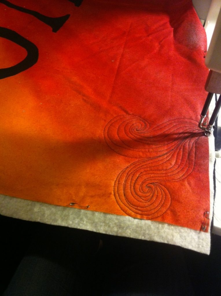
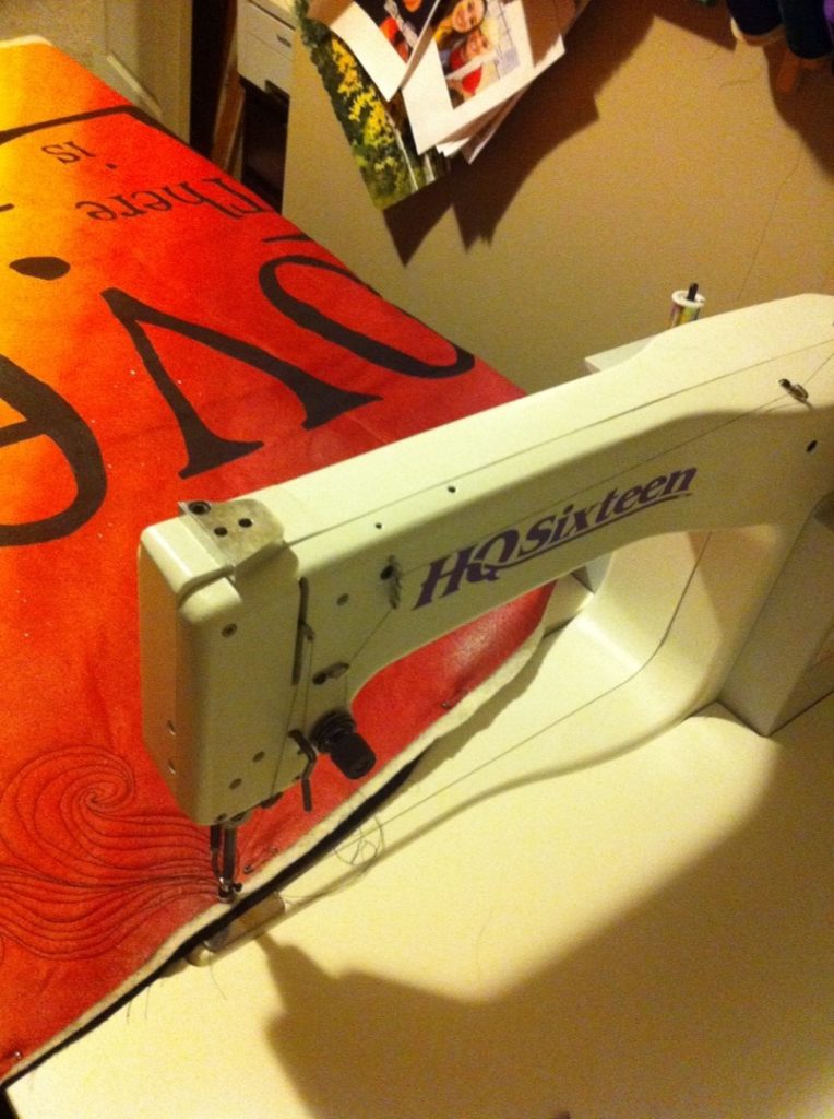
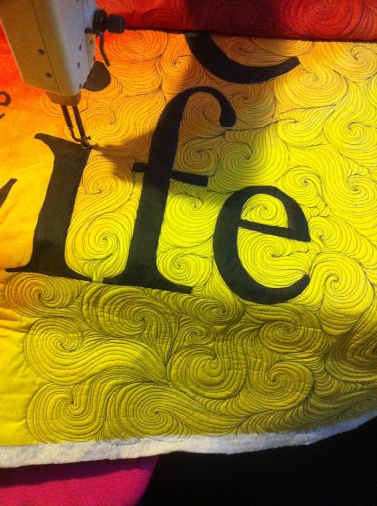
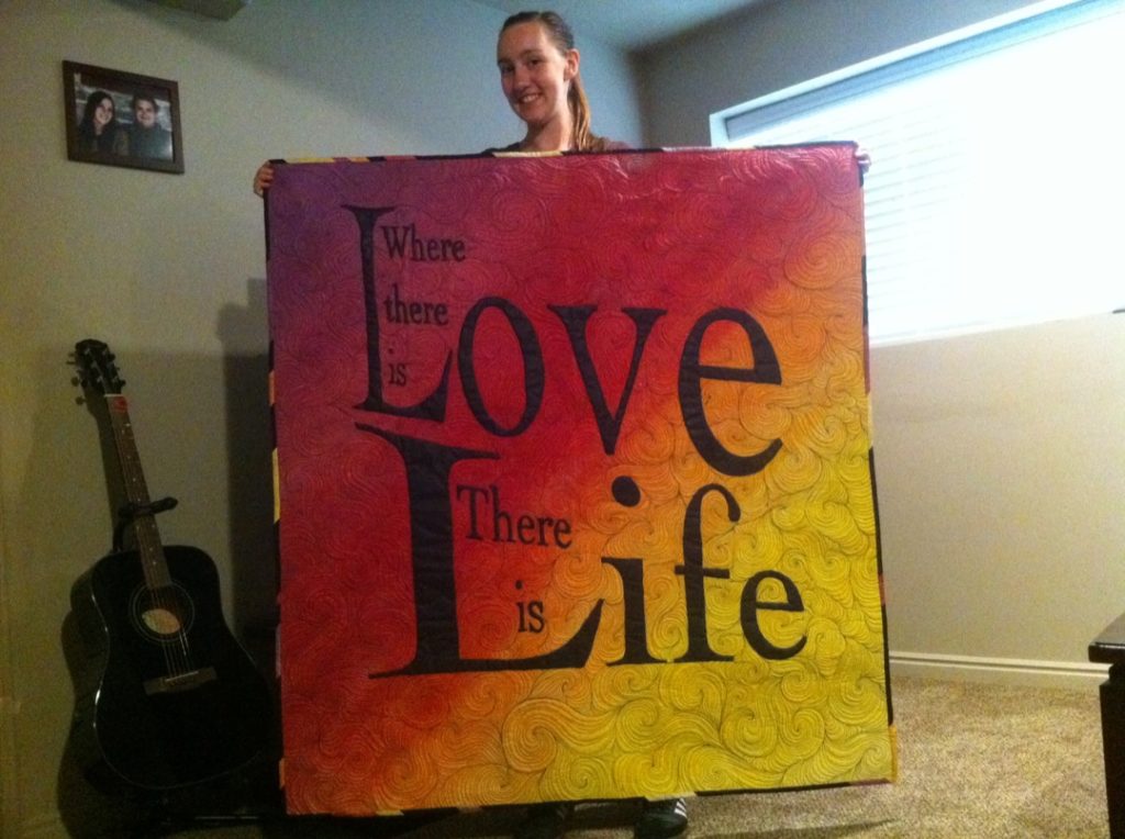
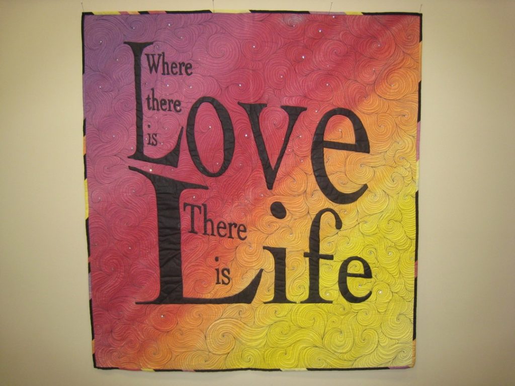
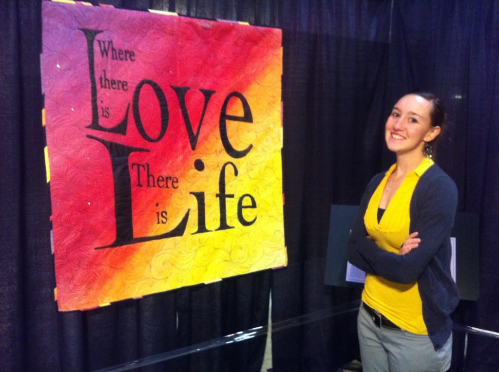
This quilt is so crazy important to me because it was the first quilt I ever had hang in an exhibit. AND IT WAS HOUSTON INTERNATIONAL QUILT FESTIVAL! Crazy, right?? This quilt was very very early on in my journey as a quilter. I started quilting in 2009 and this quilt was made in 2011. I had no idea what I was doing, especially when it came to how I would actually get my vision onto fabric, and the rules of typography. I totally broke the first cardinal rule of typography: “Thou shalt not stretch fonts”. Man this design almost kind of makes me cringe looking at the lettering more than 5 years later. But the cringe is a good sign. It means I have become more aware! Haha… So here is the process of how this quilt started… (and remember, I had NO IDEA what I was doing. I just used my artistic background from school.)
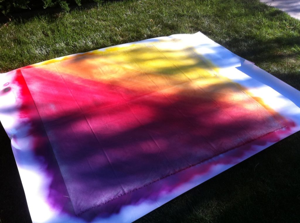
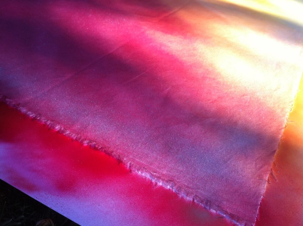
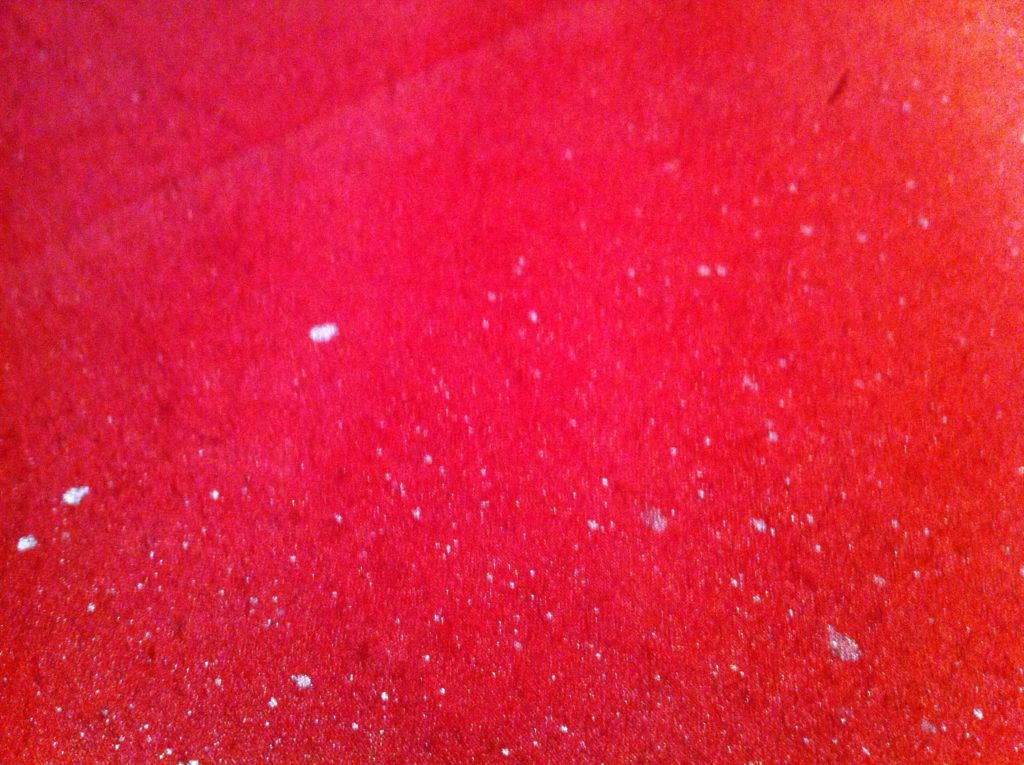
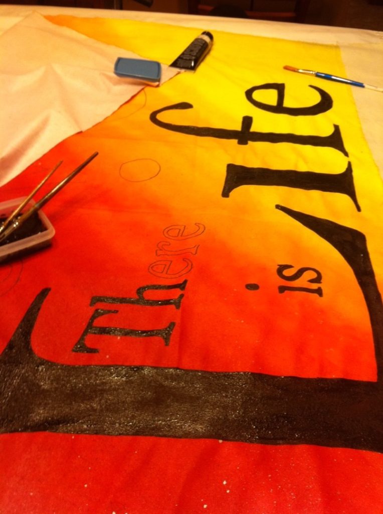
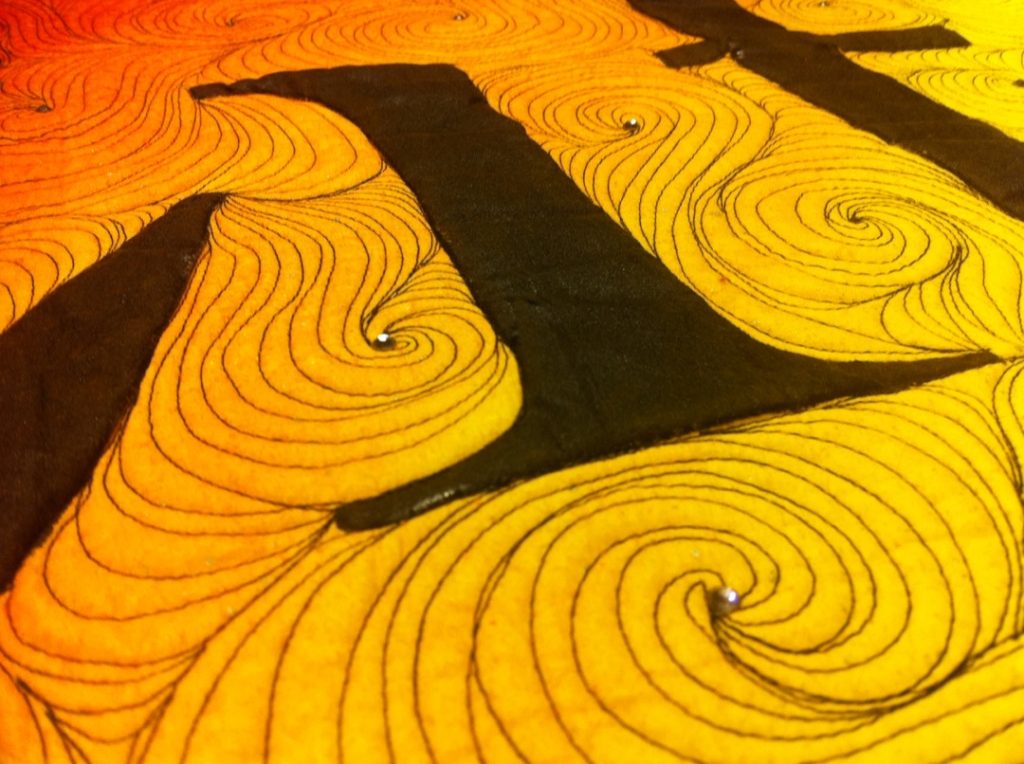
So there you have it. This quilt kind of makes me cringe, and it’s so crusty because I used non-textile paints. Lesson learned.
So here is what I learned:
-Don’t stretch fonts.
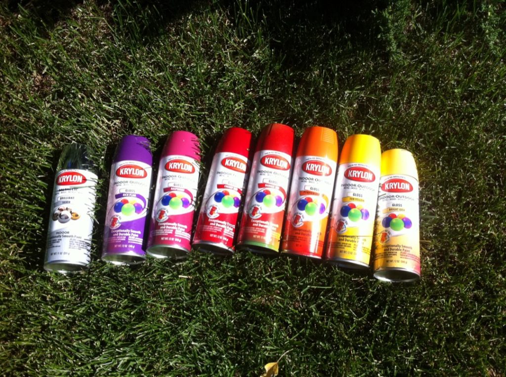
-Don’t use spray paint on fabric unless you feel like ruining the hook in your quilting machine.
-Don’t put acrylic paint on fabric unless you are totally fine with it being crusty and not at all snuggly.
-Karlee