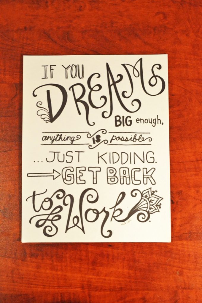
This is another great example of a stepping stone on my journey. Much like my High School art as well as my journaling art, I look back at this piece and quite honestly, it makes me cringe a little bit. But this is a GOOD THING! This means my skills have grown.
If you really just love this piece, I am about to ruin it for you just a little bit. I wanted to point out the flaws in this design, only so that I can teach you to train your eye a little more to be constructively critical of your own work. So for instance,
- In the word “Dream”, I had absolutely no idea how to mimic a brush lettering style. So, I thickened up some lines when they shouldn’t have been thickened, and then I neglected other lines that should have had muscle added to them. At the time of drawing this piece, I didn’t know that secret trick about identifying the up strokes and down strokes of a letter, and then ONLY adding thickness to the downstrokes. So, you’ll notice that in the letter “A” of dream, both sides of the “A” are thick, when I should have only done the right hand side of the “A” because that is the down stroke. The same is true for the letter “M”, the first upstroke should have been kept thin. All of this same principle applies for basically the entire words “to work”.
- The word “IS” was thickened up way too much, and now it is not very legible.
- The letter “D” in the word dream has this weird curly embellishment but the rest of the letters in the word don’t have anything. This inconsistency is sloppy.
So, overall, this piece was a great learning experience, but looking back now it is not really a piece that I would want to turn into a print or postcard and show to the world, lol.

Thanks for listening.
-Karlee
